Plotting with R
the Israeli Knesset
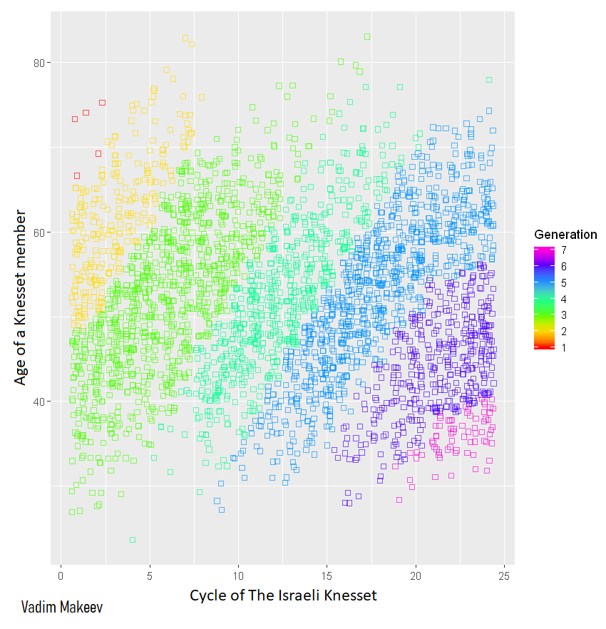
Scatter plots: "The Israel Knesset by Generations"
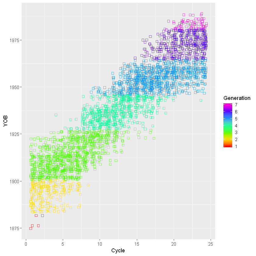
About This Chart
Each square on the scatter plot represents an Israeli Knesset member, and each color - a generation.
The data used to populate this chart was sourced from an SQL dataset I created,
Which itself was sourced from the Israeli Knesset Website.
Generational breakdown uses age brackets defined by the Pew Research Center, except for "Missionary Generation", which is defined by the Strauss–Howe generational theory:
| Name | Birth Years |
|---|---|
| 1. Missionary Generation | 1860-1882 |
| 2. Lost Generation | 1883-1900 |
| 3. Greatest Generation | 1901-1927 |
| 4. Silent Generation | 1928-1945 |
| 5. Baby Boomers | 1946-1964 |
| 6. Generation X | 1965-1980 |
| 7. Millennials Y | 1981-1996 |
Vacancies in the Israeli Knesset are not uncommon. For instance, when a Knesset member dies or resigns.
The squares on this scatter plot use the Knesset member that was holding the seat for the majority of the term.
About This Project
With the goal of creating a professional visualization from my Israeli Knesset members database, I decided to export it from PostgreSQL to R.
For a fair represantation, inclusive of duplicate values, the data was presented on a scatter plot. Here is another view with the x and y axis swapped:
The project is on-going and is periodically updated with new data and parameters.
The project is available on my GitHub.
For more works visit My Website.